Redesign of the Museum of Ukrainian Art
Website & App

My role: UX/UI designer
January 2024 to May 2024
Responsibilities: conducting interviews; creation of personas, user journeys, empathy maps, and user flows; paper and digital wireframing; low and high-fidelity prototyping; conducting usability studies; iterating on designs and responsive design.
This is an individual project as part of an educational program from Google that allowed me to sharpen my overall experience with websites and mobile apps as a UX designer. The presented project is a concept not intended for commercial use.All rights to the images belong to their respective owners.
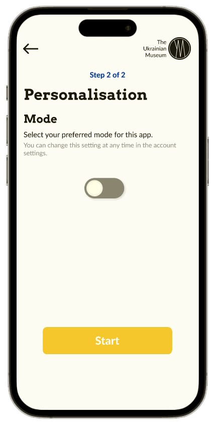
My task was to make a mobile app and then an adaptive website for a local art museum. I realized that in this case it was better not to take information from my head, where there would be perfect pictures, information only that fits the layout, in general a cut-out design. It would make the job simpler. I realized that I couldn't take the easy road, that I needed to go deeper into this project. I wanted my work to look like it was done for a real customer.

Of course, at first I thought of making a site for museums like Van Gogh (Netherlands) or the Centre Pompidou (France). But once again, the design is updated regularly, it's beautiful as it is, and there are plenty of such works on Behance. It's a simplification of the work.

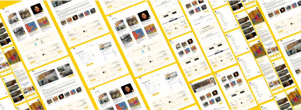
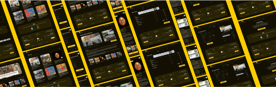
I continued to go through the possible options, searching for links on the Internet, and came across my option —  the Ukrainian museum in North America.

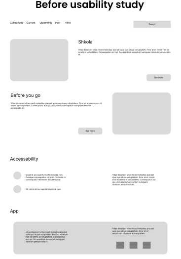
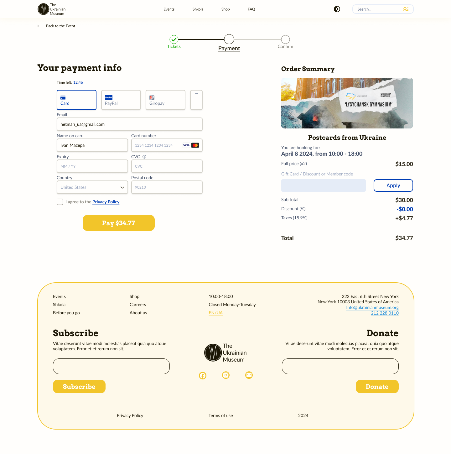
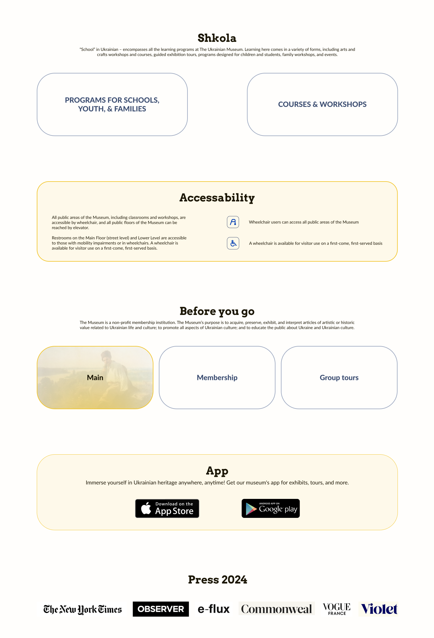
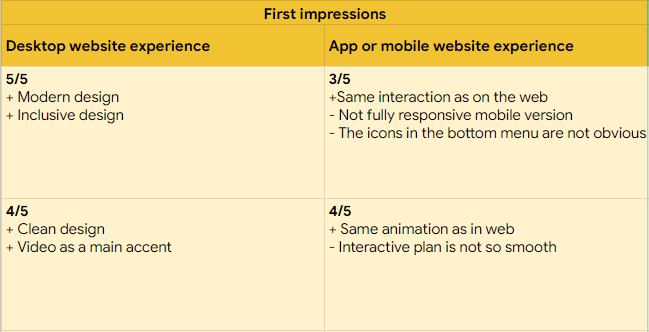
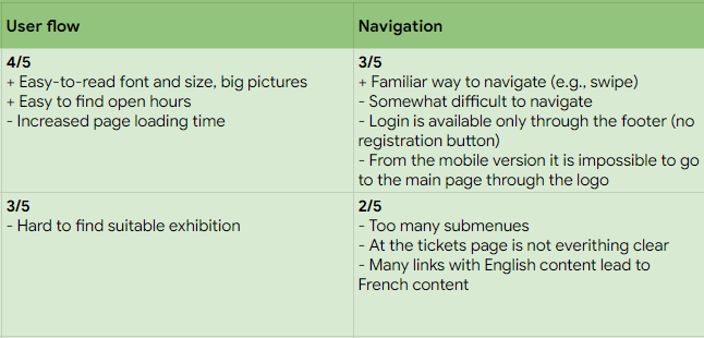
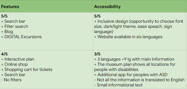
It was clear from the website that they were a developing organization, but promotion through a web site was apparently not a priority. The site lacked information, user flow was not quite clear to me, and the quality of content left much to be desired. I wanted to remedy this situation and got to work.
Project overview
For your ease of access, I've combined the website and the app into one study.
Lable of the site
The Ukrainian Museum is the largest museum in North America committed to acquiring, preserving, exhibiting, and interpreting articles of artistic or historic significance to the rich cultural heritage of Ukrainians. The Museum is a non-profit membership institution. The Museum’s purpose is to acquire, preserve, exhibit, and interpret articles of artistic or historic value related to Ukrainian life and culture; to promote all aspects of Ukrainian culture; and to educate the public about Ukraine and Ukrainian culture.
The problem
Since the task was to make an application and a website, there are two problem statements:
1
The main problem with the website was the inconspicuous design and confusing user flow.  
2
On the other hand we have an app that lacked different types of information, a confusing interface, problems with buying tickets, and a lack of user-friendly navigation.
The goal
The main goal was to create an application and a web site accessible to users of different levels of technology skills. Since visiting museums is not only for users with high e-literacy, the design should be intuitive and not be difficult when performing basic tasks: viewing events, ordering tickets, and exploring information about the museum.

From there, our first phase of design process pops out.
Emphasising
A penny for your thoughts
The first step in working on this project was to conduct research on target audience. The purpose of this was to obtain complete and accurate information about potential customers, which helped me to realize the needs of the target audience.

To understand who I needed to tweak the design for, I created a questionnaire. Since I didn't have any database of regular clients and site visitors, my acquaintances and other students of the course participated in my study. In total, 12 users participated. Based on the results of the test, I weeded out unsuitable candidates who were not interested in going to museums offline, I created some basic user personas to better understand their needs.

According to the results of research, it was found that many potential customers were interested in learning about the accessibility of the museum and its history, and also there were problems with finding the right event and booking tickets.
Problem statement 1:
Pavlo lives temporarily in New York and needs a clear website to view all the information about the museum because it is important to him to keep the cultural values.
Problem statement 2:
David is an art student who needs an app to quickly find exhibitions and buy tickets because he likes to find inspiration in Ukrainian art.
Ticket Purchasing
Issues such as unclear pricing information, payment processing errors, or a cumbersome checkout process may result in abandoned purchases.
Navigation
If the web or app navigation is confusing or poorly organized, users may have difficulty finding the desired sections or features.
Lack of general information
If the web or app navigation is confusing or poorly organized, users may have difficulty finding the desired sections or features.
Pains of the target audience.
In addition, I analyzed in detail a number of similar websites that have similar themes. Through analyzing direct and indirect competitors, I sought to understand their advantages and disadvantages so that I could use this in my work.
Competitor audit.
Creating visuals
So far so good
In his book Building a Storybrand, Donald Miller writes, “If you confuse, you lose.”
Since navigation was a major concern for users, I emphasized an understandable information architecture.  I focused on categorizing the sections in a commonly accepted way, so that you don't have to guess where to find certain information. 
An example of a web application sitemap.
Keeping in mind the main user concerns that I was able to get during the emphasising phase, I created paper sketches.
Paper wireframesPaper wireframesPaper wireframes
The variants of the main page of the website and app.
Digital wireframes 
Moving on to the digital wireframes, I made a few design changes and this is the final version I got. I favored a simple and concise design, so that a user with any level of internet skills can reach their end goal. In the design process, I tried to think about how other people would be more comfortable doing an action.
Digital wireframe (web version)
Thinking first and foremost of the user, I designed a successful ticket purchase page with the ability to instantly view their tickets and learn about additional information needed before going to the museum (such as general rules and accessibility).
Digital wireframe (app version)
Low-fidelity prototype
At this stage, I did some usability testing. My unmoderated study involved 5 people, the testing itself took 8 to 15 minutes and took place over a global web. Key Performance Indicators were time on task, user error rates, conversion rates and system usability scale (SUS).
Script for usability testing
Findings
Text contrast
Some participants noted that the text seemed monotonous.
Reminder
Users want a reminder option so they don't miss an event if tickets were purchased in advance.
Easy navigation
One of the most exciting findings was that 100% of participants reported they would use this app.
Since our app targets different user groups, I needed to work out the text contrast for a smoother experience. And it also revealed that users would like to receive reminders of upcoming events for which tickets have been purchased.
lo-fi prototype
 Ideas hamster
Iterate, iterate, iterate...
Choosing the color palette, I went through a lot of options, but decided on the more obvious yellow and blue variant, like the Ukrainian flag, to reflect the theme of the museum. The idea may seem trivial to some, but I chose this option for a reason.

I thought about the fact that this is a museum of Ukrainian culture in America, and those Ukrainians who visit it, most likely, are sad for their homeland. And when they visit the site or the app, they will see familiar color combinations, which can lift their spirits a bit. That's as far as Ukrainians are concerned.

Of course, this museum can be visited not only by people of Ukrainian nationality, but also by people of all kinds of other nationalities, which means that they can use the app and website too. For them, it will probably just be a good combination of colors.
Components library
Components library of the TUM (The Ukrainian Museum).
Color palette
Selected color palette.
After the usability study, I selected the more important notes and started creating mockups. Participants commented that it would be more convenient if the mode change button was not hidden so far away in the settings. 
I also had to shorten the animation time at the loading page.
Loading animation
As for the web site, here users noted insufficiently simple flow of information, so in the hi-fi mockup I tried to simplify the information layout.
I also adapted the design for different types of devices: computer and laptop, tablet, phone.
Adaptive frames
Accessibility
Everyone is different, everyone has a different destiny and different opportunities. No matter whether the disability is permanent, temporary or situational, everyone must successfully reach the end point. I've tried to extend the features of the site and app, in order for more users to have a good experience with this design. In particular, I added the ability to choose between dark and light mode in the website and app, as well as the ability to change the font size in the app.
Accessibility frames examples
I felt it necessary to add hierarchical headers and I made sure my primary colors met WCAG AA Compliance in both web and app versions.
WCAG AA Compliance
Adaptive frames dark version
Dark version of the museum's mobile app and adaptive website
Impact
Creating a design for a large group of people (from schoolchildren to seniors), I made sure that the design would be convenient and understandable for people with different e-literacy and limitations. The redesign of the Museum of Ukrainian Art for Web&App has had a positive impact on the user experience.
Participants noted that “The interface is very clear to understand and to make a choice.”